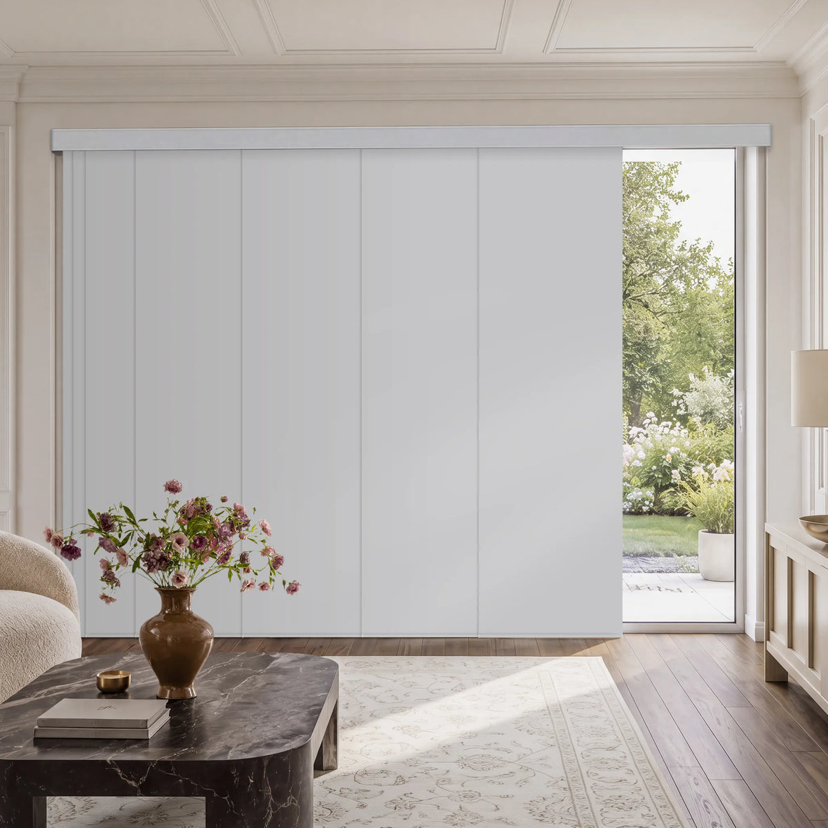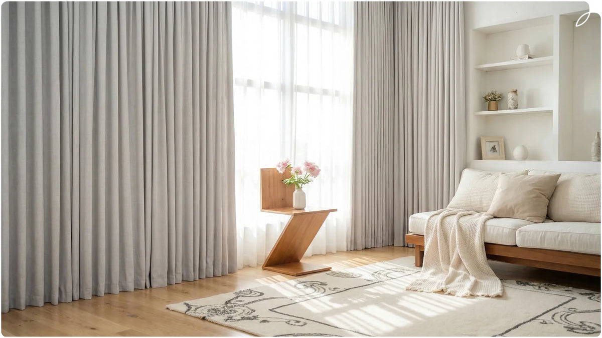
The best shade color should coordinate with your room's undertones, support its light-control needs, and look consistent in daylight and artificial light. Warm white, cream, beige, and greige are flexible choices, while charcoal, blue, green, and deeper tones create contrast. Color alone does not determine blackout performance, privacy, or insulation. If you are asking, "What color shades should I get?" begin with your walls and floors, then choose the fabric and opacity required for the room.
Harmonizing Shades with Your Existing Decor
Start with the largest surfaces. Shades do not need to match the walls or floor exactly, but their undertones should feel related.
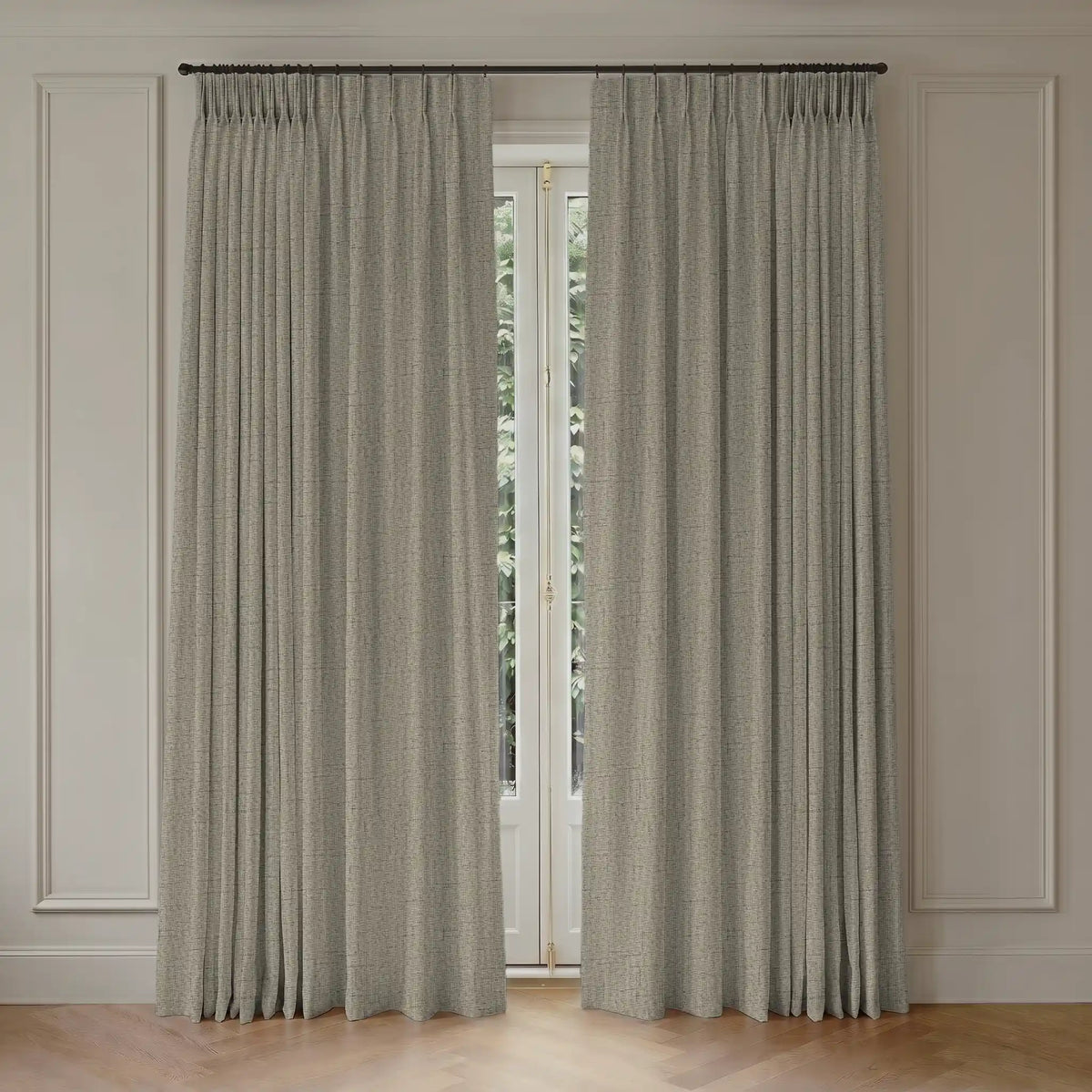
- Wall-relative rule: Choose the same undertone family as the wall, then go slightly lighter or darker. Warm walls often pair with cream, beige, or warm greige. Cool walls often suit white, grey, or blue-based neutrals.
- Echo the floor: Repeat the floor's warm or cool undertone instead of copying its exact color. Wood floors can also be referenced through tan, brown, or textured natural shades.
The Reliable Neutrals
Neutrals provide a flexible base for rooms that change often.
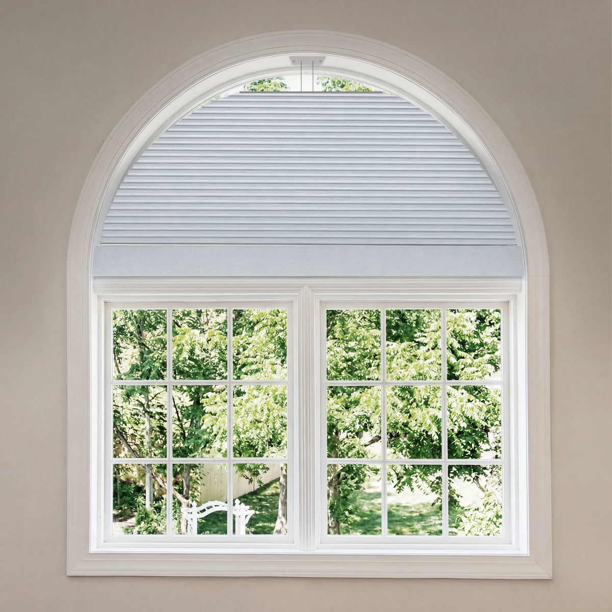
- Warm white or cream: Keeps the window visually light and suits light-filtering roller or sheer Roman shades.
- Greige: Connects beige and grey elements, but its undertone should still be checked against the wall.
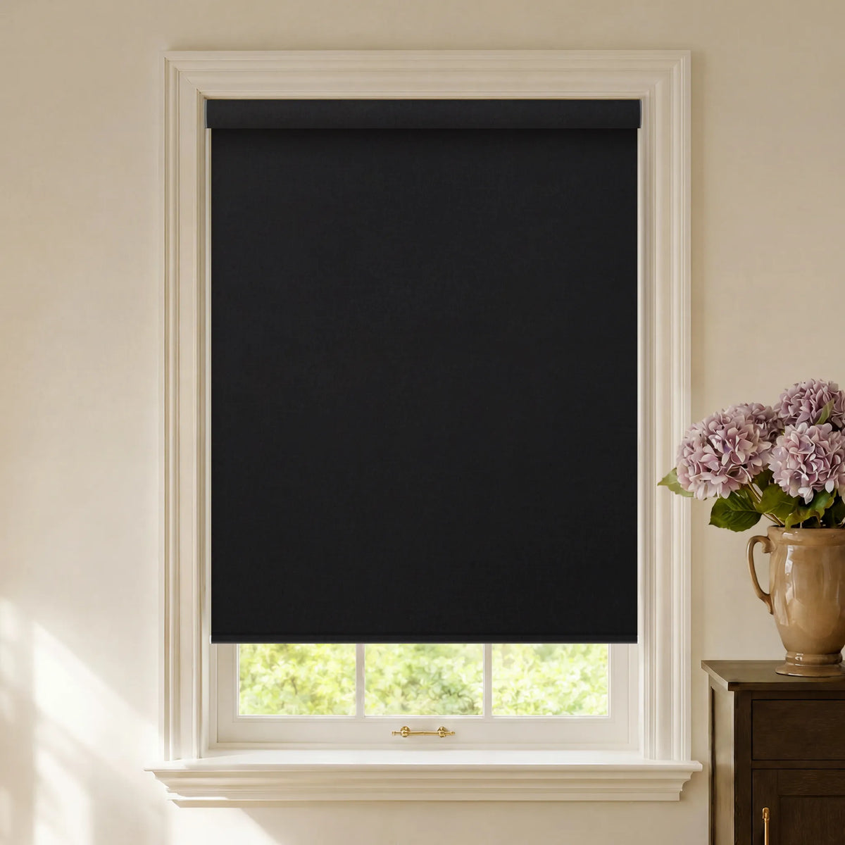
- Charcoal: Adds contrast in bright rooms. On solar fabrics, darker colors can improve outward view clarity, but openness and lighting also matter.

Functionality First and Color by Room
Room function should guide fabric opacity before color. Color can then shape the visual mood.
Bedrooms
Bedrooms benefit from quiet colors and the right blackout construction.
- The performance rule: Blackout fabric can work in light or dark colors. Darkness also depends on side gaps, mount type, cassette, and side channels.
- The palette: Slate grey, dark blue, deep green, beige, and warm white can all work. Choose darker tones for a more enclosed look and lighter tones for a softer room.
- Graywind option: Graywind Roman Shades offer blackout and light-filtering choices. Confirm fabric opacity rather than judging performance by color.
Living Rooms
Living rooms usually need daylight, privacy, and a color that coordinates with several furnishings.
- The strategy: Pale neutrals such as oyster, linen, warm white, and light beige keep the window from feeling visually heavy.
- The visual effect: An outside-mounted shade above and beyond the frame can make the opening appear larger. Placement and coverage create this effect, not color alone.
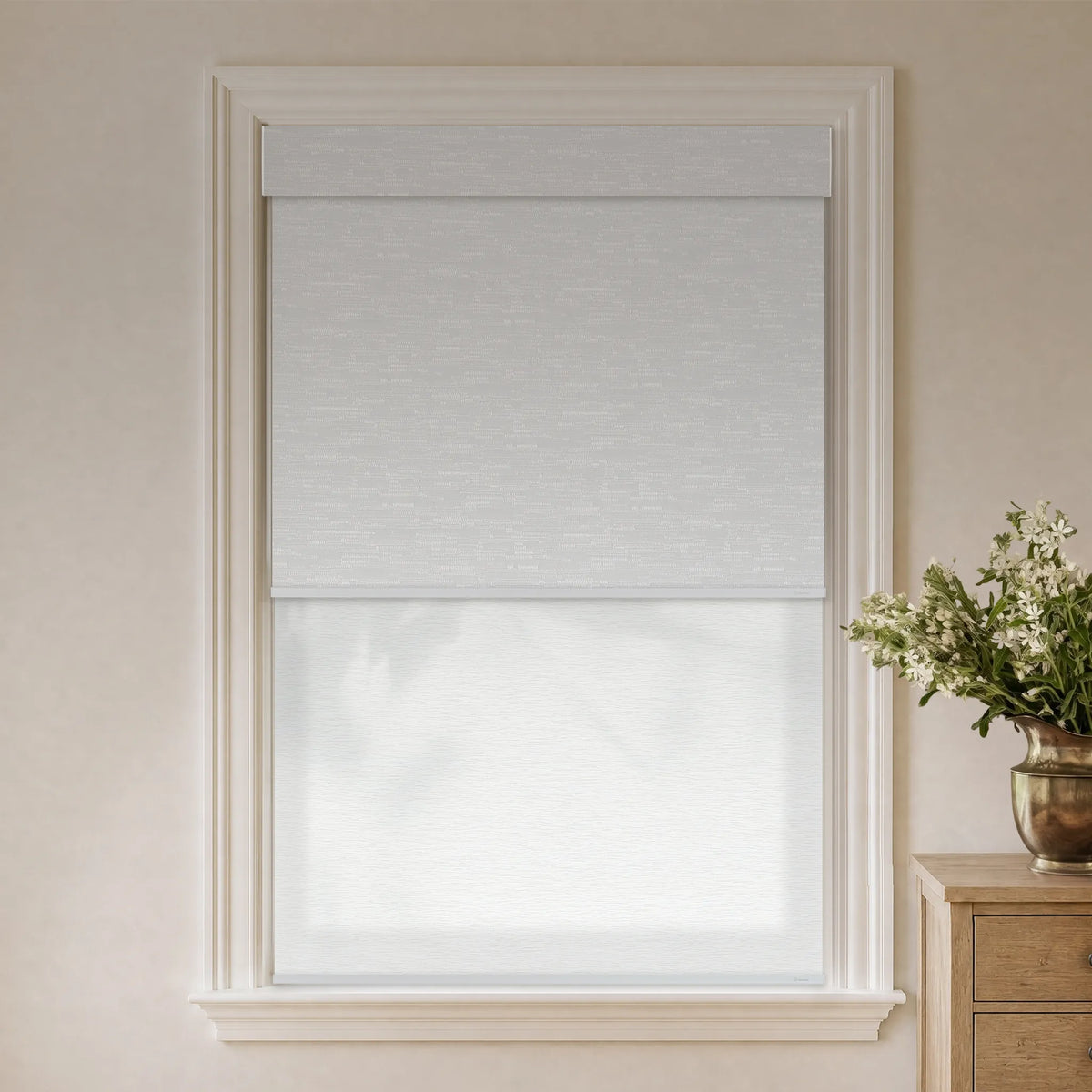
- The consideration: For television glare and changing privacy needs, Graywind Dual Shades combine two independently controlled fabrics in one system.
Kids Rooms
Choose color without overwhelming the room's other finishes.
- The balance: Powder blue, blush, seafoam, denim, and olive can provide color without relying on neon tones. Brighter colors can still work as accents.
- Safety first: The U.S. Consumer Product Safety Commission states that cordless coverings are safest when young children are present. Motorized shades avoid accessible operating cords.

How Material Changes Color
The same color changes across materials because texture, sheen, weave, and opacity affect its appearance.
- Fabric Roman and roller shades: Woven textures soften color, while smooth fabrics appear more uniform. Always view a sample in the room.
- Faux wood and aluminum blinds: Hard surfaces reflect more visible highlights. Matte finishes usually look softer than glossy finishes, while product specifications should determine suitability for humid rooms.
- Real wood blinds: Stain interacts with the natural grain, so cherry, maple, or walnut tones will include variation rather than appearing completely flat.
Pantone's New York Fashion Week Spring/Summer 2026 report mixes expressive colors with seasonless neutrals. It is a fashion forecast, not an interior rule, but several shades translate into window styling.
- White Onyx and Angora: Use these soft neutrals as a quiet base for living room shades.
- Lava Falls and Burnt Sienna: Use these warm colors as accents when a statement shade would limit future decorating choices.
- Alexandrite: This saturated teal can create a focal point in an office or library. Confirm the actual fabric in your lighting before ordering.

Graywind Color and Material Options
Graywind combines custom sizing, fabric choice, and several motor systems. Color should still follow room use, fabric specifications, and the selected smart-home setup.
Color Precision
Use Graywind fabric swatches to compare color and texture throughout the day. The free sample policy covers eligible U.S. addresses and up to three swatches per order.
Material Options for Different Rooms
- Kitchen and bathroom: The Graywind roller shade collection includes vinyl in White, Beige, Light Grey, Dark Grey, and Coffee. Confirm the selected fabric's care guidance.
- Bedroom: Graywind blackout roller shades include verified colors such as Dark Grey, White, Beige White, and Coffee. Blackout performance comes from the selected fabric and installation, not from choosing the darkest color.
- Living room: Light-filtering options include Texture Linen Beige, Texture Jacquard White, and Sheer White.
Smart Home Integration
Compatibility depends on the motor. Graywind's Smart and Control Guide shows that Bluetooth, Zigbee, Matter, hardwired WiFi, and Eve options support different apps, hubs, and platforms. Select the motor for your ecosystem and use scheduling when supported.

Compare samples before ordering. Dark Grey may suit a bedroom, while Texture Linen Beige may work where softer daylight is the priority. Choose color after confirming opacity, material, mount, and motor.