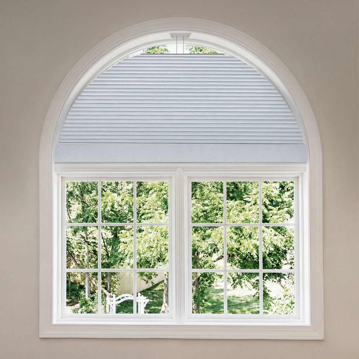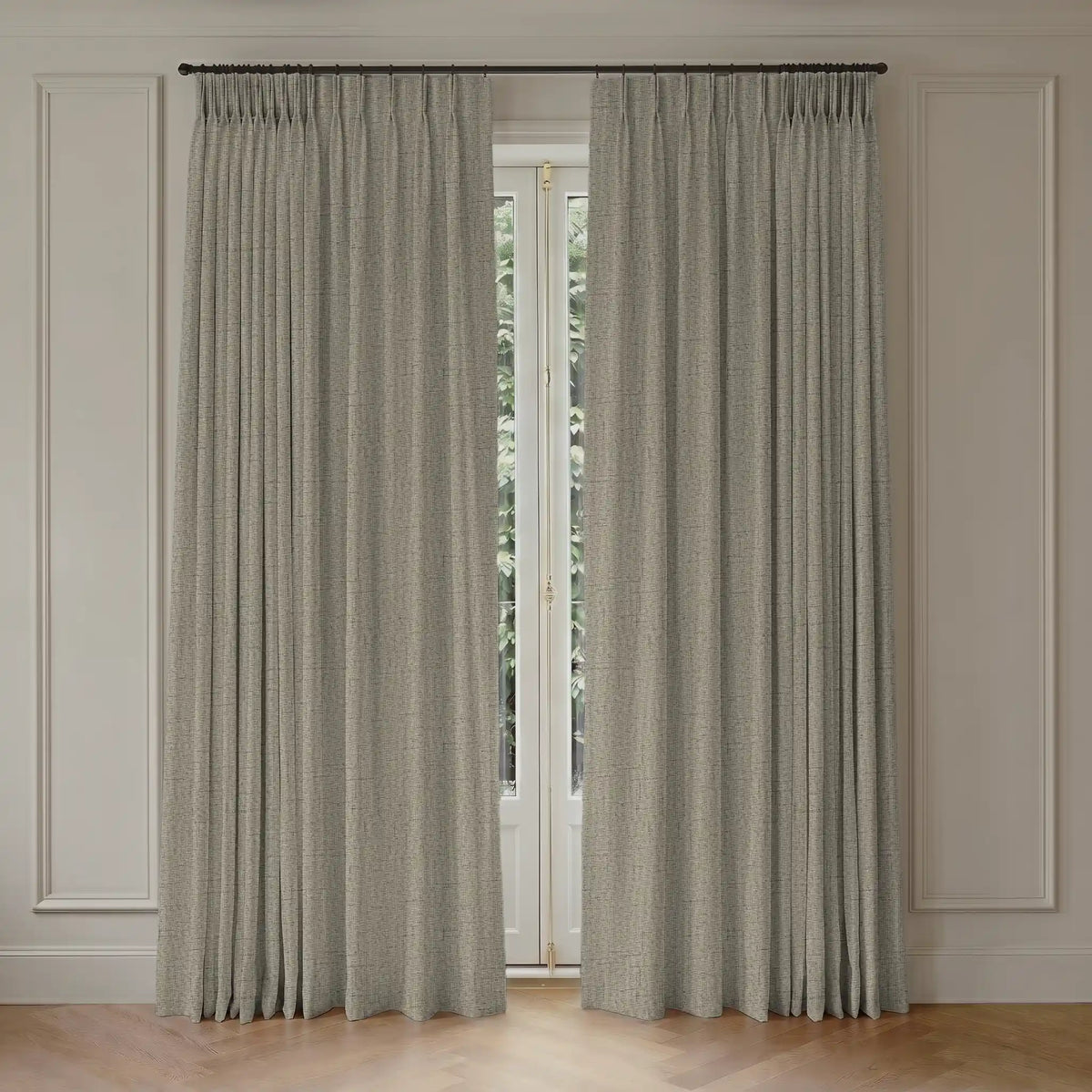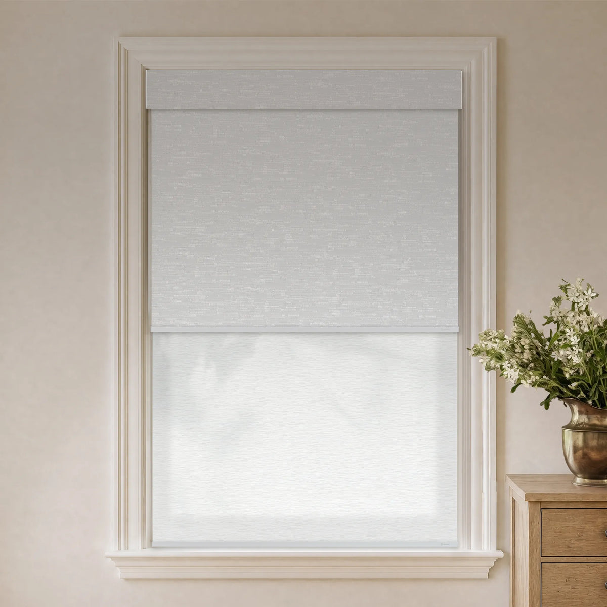
Choosing the perfect window treatments is more than just picking a style--it's about creating harmony in your space. Color coordination plays a crucial role in tying your room together, enhancing the mood, and even influencing how spacious a room feels. Whether you're redecorating or starting from scratch, this guide will help you navigate the world of color with confidence.

Understanding Color Theory Basics
Consider these basic color concepts:
- Color Wheel: Shows relationships between colors.
- Complementary Colors: Opposites, such as blue and orange, that create contrast.
- Analogous Colors: Neighbors, such as blue, green, and teal, that create harmony.
- Neutral Colors: White, gray, beige, and black provide balance and flexibility.
Apply these basics when selecting window treatments.
How to Choose a Window Treatment Color
The right color depends on your walls, furniture, flooring, and preferred atmosphere:
Matching vs Contrasting with Wall Color
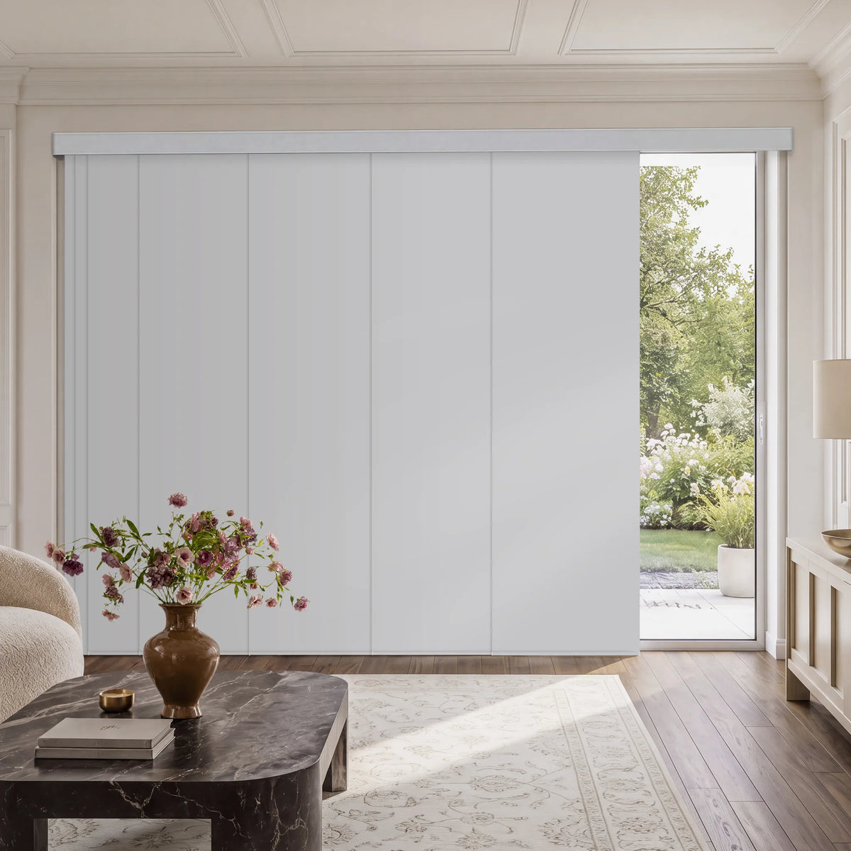
- Matching: Blinds or curtains matching the walls create a unified, minimalist look.
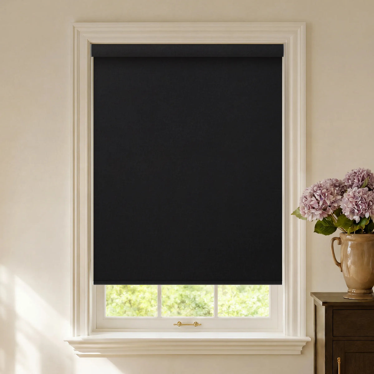
- Contrasting: A standout color draws attention to the window. Dark blinds against light walls can add depth.
Should Blinds Match the Trim or Wall Color?
Choose according to the intended effect:
- Match the Trim: Matching prominent trim, such as white crown molding, creates a cohesive look.
- Match the Walls: Matching the walls helps windows recede into the background.
Contrasting the trim can also suit modern interiors.
Coordinating with Furniture Style
- Modern: Consider neutrals or bold contrasts, such as black against white.
- Traditional: Burgundy or navy can add elegance.
- Rustic or Farmhouse: Beige, olive green, and natural-looking materials complement the style.
Tying In Flooring and Decor
Window treatments should complement flooring and accents:
- Pair warm hardwood with beige or brown blinds.
- Repeat colors from artwork or pillows in the curtains.

How to Choose the Right Window Treatments
Beyond color, consider these factors in Graywind's window treatment selection guide:
- Functionality: Light control, privacy, or insulation.
- Style: Blinds, shades, curtains, and shutters create different looks.
- Room Purpose: Bedrooms may benefit from blackout curtains, while living rooms may suit sheers.
How to Pick a Color for Blinds
When choosing a color for blinds, keep these tips in mind:
Sample First:
Always test samples in your home lighting before deciding.
Consider Size:
Light colors make small rooms feel larger; dark colors add coziness to large spaces.
Psychology of Color:
- Blue: Calming and serene—perfect for bedrooms.
- Yellow: Energizing and cheerful—great for kitchens or playrooms.
- Green: Fresh and balanced—ideal for living areas or home offices.
- Neutrals: Versatile and timeless—suitable for any room.
Pro Tips for Using Color Strategically
- Make a Small Room Look Larger: Choose light-colored blinds or curtains that match the wall color. This eliminates visual breaks and expands the space.
- Lower a High Ceiling: Use darker window treatments mounted at the top of the window to draw the eye downward.
- Highlight the Window: Frame your window with bold-colored treatments to make it a focal point.

Why Choose Graywind for Your Window Treatments?
At Graywind, we understand that window treatments are a key element of your home’s design. Our products are crafted with precision and care, offering:
- Premium Quality: Durable materials that stand the test of time.
- Wide Range of Options: From minimalist blinds to custom printed shades, we have something for every style.
- Custom Printed Shades: Looking for something unique? Our printed shades allow you to express your personality with patterns and colors tailored to your taste. Whether you want to match your decor or make a statement, Graywind has you covered.
Explore Graywind today and transform your windows into works of art!