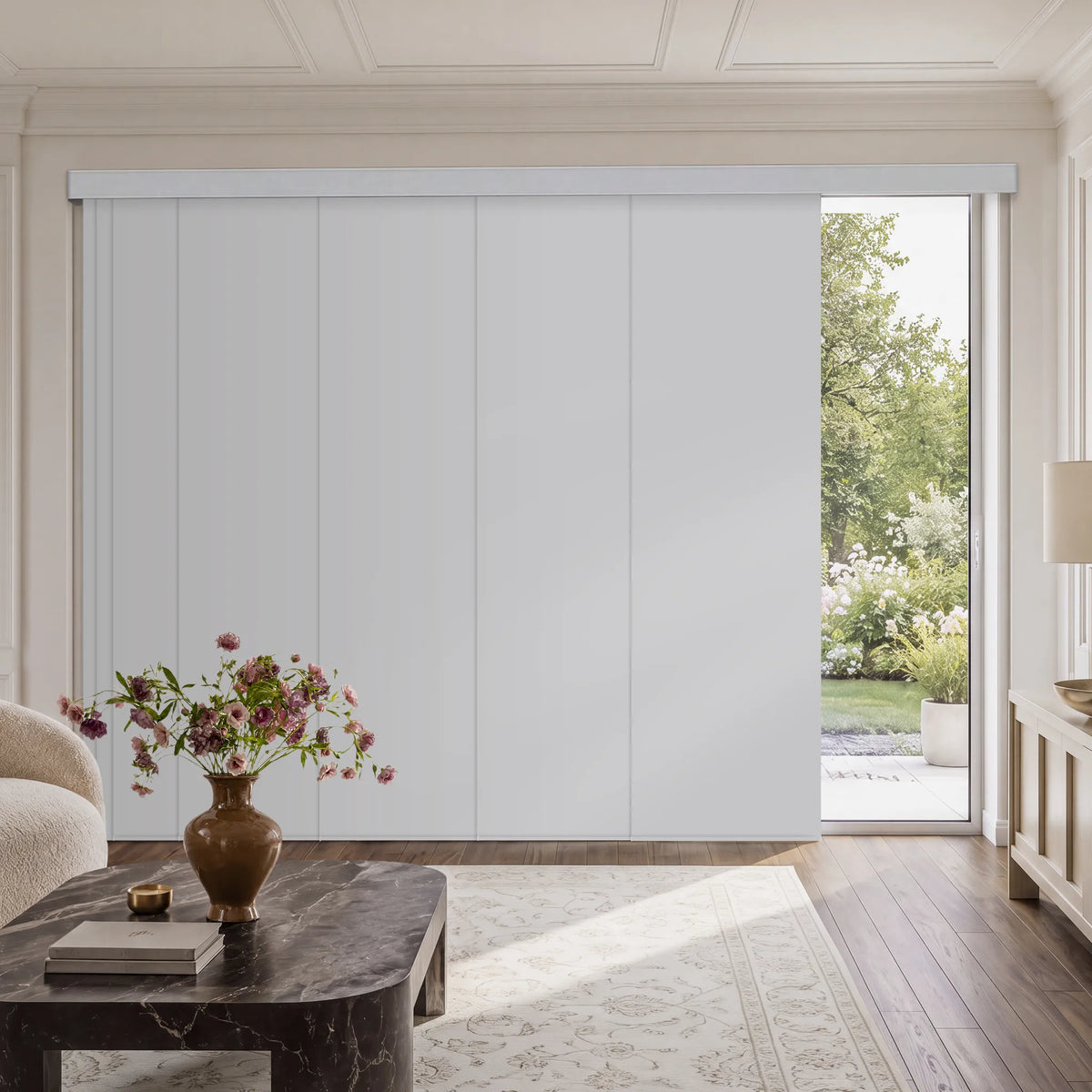
Bold colors work best for window treatments when the room needs a focal point, a stronger design identity, or a better sense of proportion. Deep navy, charcoal, forest green, burgundy, and brighter accent shades can give a neutral room character or make a large, bright space feel more grounded. They are less successful when they compete with several existing focal points, reduce the sense of space in a small dark room, or ignore how the room is used. The right decision starts with function and mood, then considers daylight, scale, material, and the color's relationship to the rest of the interior.
How Bold Window-Treatment Colors Affect a Room
Because window treatments cover a large vertical surface, their color can influence where the eye rests, how substantial the window feels, and whether a room appears energetic, quiet, formal, or intimate.
Color psychology is a useful starting point, not a fixed rulebook. Research reviews note that responses depend on context, culture, personal associations, brightness, and saturation. Treat common associations as design guidance rather than guaranteed emotional effects.
Deep and Saturated Colors
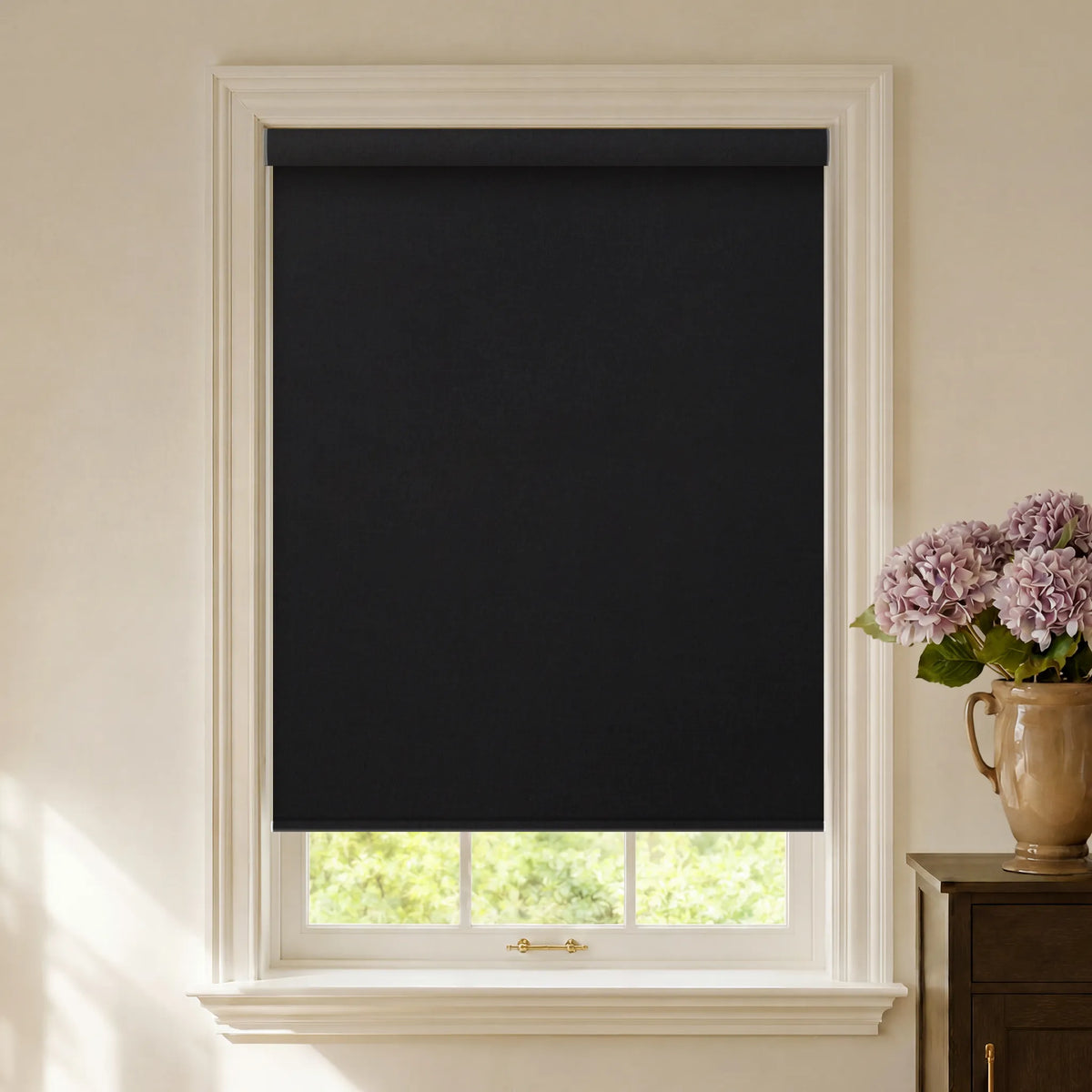
Deep navy, charcoal, forest green, and burgundy create visual weight and controlled drama. They suit formal dining rooms, libraries, media rooms, and spaces where enclosure is welcome. Roller shades feel architectural; curtains or Roman shades soften the color through folds and texture.
Warm Bold Colors
Reds, oranges, ochres, and saturated yellows tend to read as active and sociable. They suit living rooms, dining areas, and entertainment spaces. Rust, terracotta, wine, and muted mustard can add energy without appearing excessively bright.
Cool Bold Colors
Deep blue, emerald, teal, and blue-green often feel calmer and more contained. They can support a focused home office or a restful bedroom. Electric blue creates sharp contemporary contrast; navy or smoky teal feels quieter.
The practical rule is simple: choose the emotional goal for the room before choosing the color family.

When Should You Choose Bold Colors for Window Treatments?
When the Room Needs a Focal Point
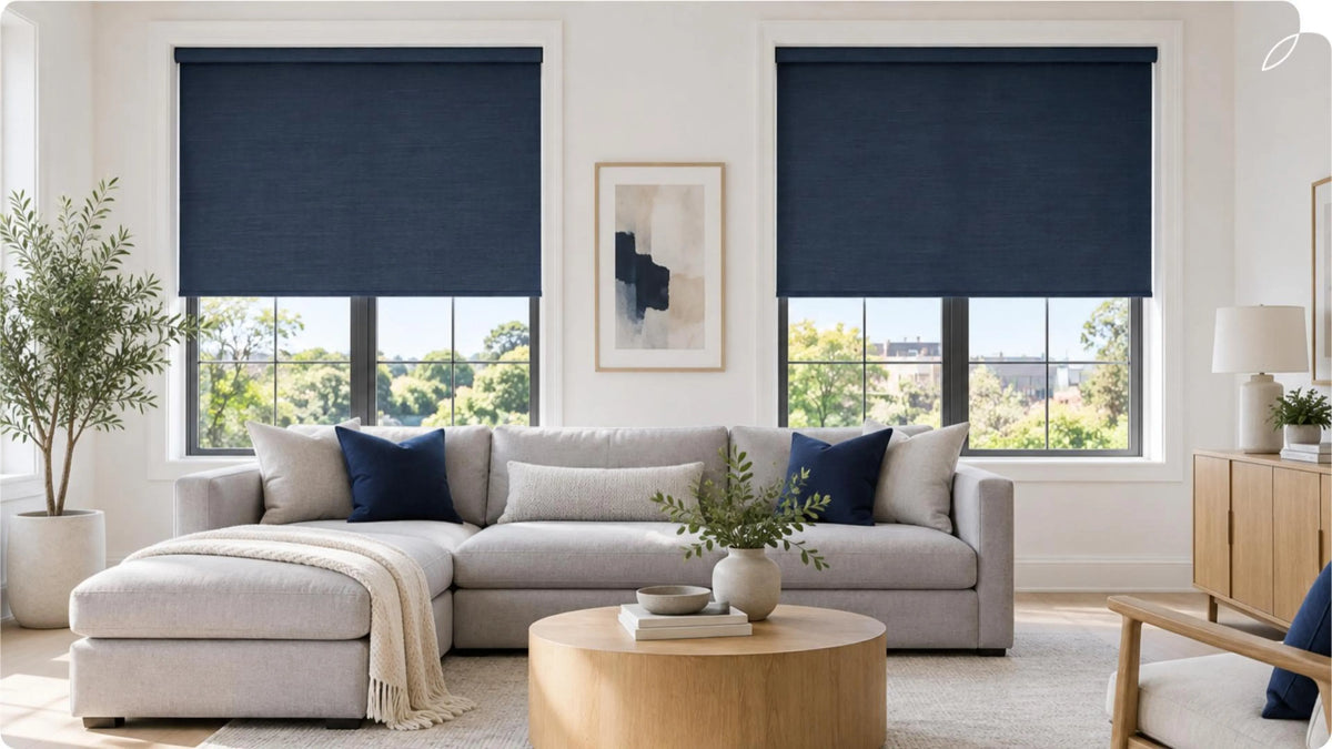
A bold shade or curtain can complete a room built around white walls, a gray sofa, light wood flooring, and restrained accessories. Deep navy roller shades in a white living room, for example, can frame the windows and add definition without requiring a new rug or statement wall.
This works best when the window is symmetrical, centered, or architecturally important. High contrast may emphasize an awkwardly placed window; a wall-related tone or a repeated accent elsewhere can reduce that effect.
When You Want to Reinforce an Interior Style
Bold color should speak the same visual language as the room:
- Modern: Electric blue, vivid yellow, or a strong primary color can interrupt a black, white, and gray palette with a deliberate graphic contrast.
- Bohemian: Peacock blue, jewel red, saffron, and emerald mix naturally with layered textiles, global patterns, plants, and collected objects.
- Traditional: Burgundy, deep green, navy, and muted gold support dark wood, tailored furniture, and classic architectural details.
- Industrial: Charcoal and navy complement concrete, brick, black steel, and weathered wood without making the palette feel busy.
Also check undertones and finishes. A cool blue may clash with warm cream walls, while muted blue-green can bridge them.
When a Large or Bright Room Needs More Visual Weight
Large rooms with tall ceilings or generous daylight can carry darker treatments without feeling closed in. Deep color brings the perimeter visually inward, making the space feel warmer and more settled.
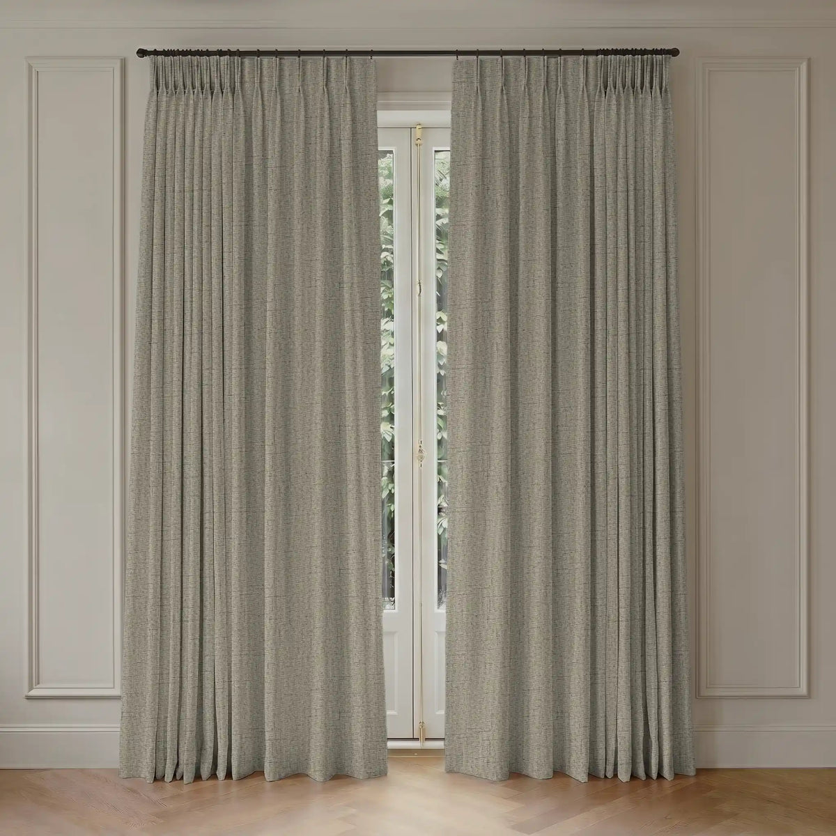
Scale the treatment to the architecture. Floor-length colored curtains create a broad field of color and the strongest impact. Roman shades add color in a softer folded form. Roller shades provide the cleanest block of color and are easier to use as a controlled accent.
When You Want to Express Personality
Window treatments can introduce a favorite color without changing walls, cabinetry, or flooring. Connect it to artwork, a rug, an occasional chair, cushions, or the outdoor view.
An exact match is unnecessary. Repeating a related undertone or using the same color at a different intensity usually looks more layered than matching every element precisely.
How to Use Bold Color Without Overwhelming the Space
Start With the Room's Fixed Elements
Identify whether the undertones in flooring, stone, cabinetry, and large furniture are warm, cool, or neutral. Relate the treatment color to at least one fixed element.
Control the Amount of Color
In a small room, one boldly dressed window may be enough. Dark treatments on every opening can reduce visual breathing room, especially with limited daylight. For several windows, use a toned-down hue.
Test Color in Changing Light
Color rarely looks the same online and at the window. Test a fabric sample in morning light, afternoon sun, cloudy conditions, and artificial light. View it as the treatment would appear both open and closed.
Let Texture Adjust the Intensity
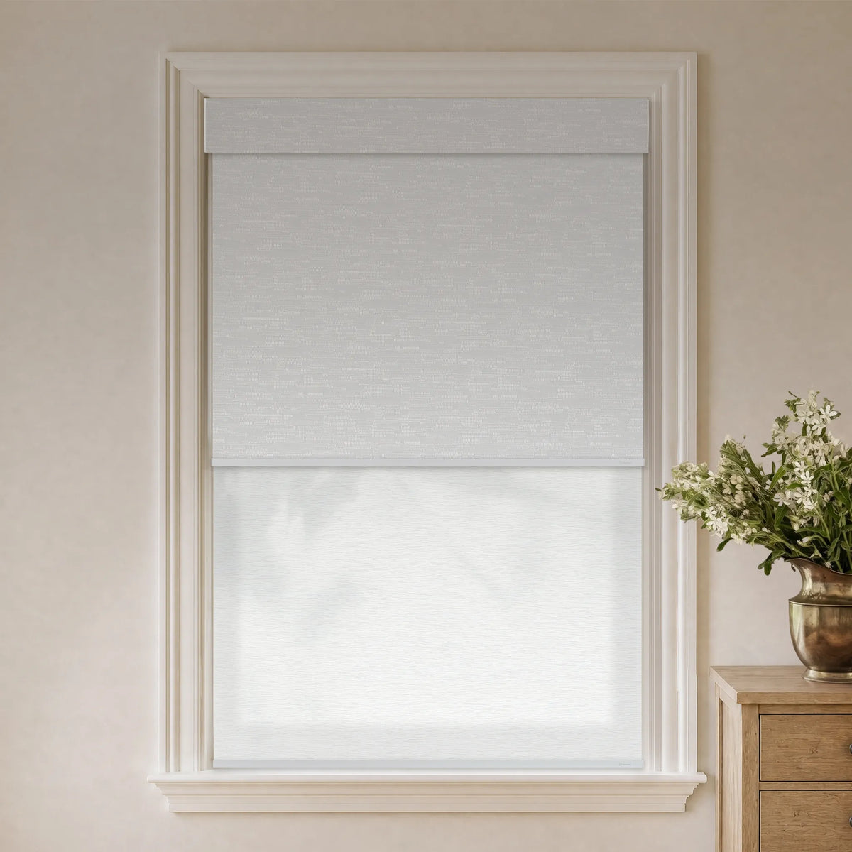
Smooth fabric presents color clearly. Woven or heathered textiles break up the surface and soften a strong hue. Light-filtering materials change as daylight passes through, while blackout fabrics generally show a denser color field.
Decide Whether to Match or Contrast the Wall
Use contrast when the window should become a feature. Choose a related tone when the room needs continuity. For example, emerald shades against pale warm gray create a clear focal point; smoky blue shades against a soft blue-gray wall produce a more enveloping effect.
Common Mistakes to Avoid
- Choosing from a screen alone: Screen settings and product photography cannot reproduce how a fabric responds to the light in your room.
- Ignoring the closed position: A curtain or shade may look like a narrow accent when open but become one of the room's largest color surfaces when closed.
- Using too many competing focal points: Bold window treatments, patterned wallpaper, a vivid sofa, and large artwork can all demand attention. Decide which element should lead.
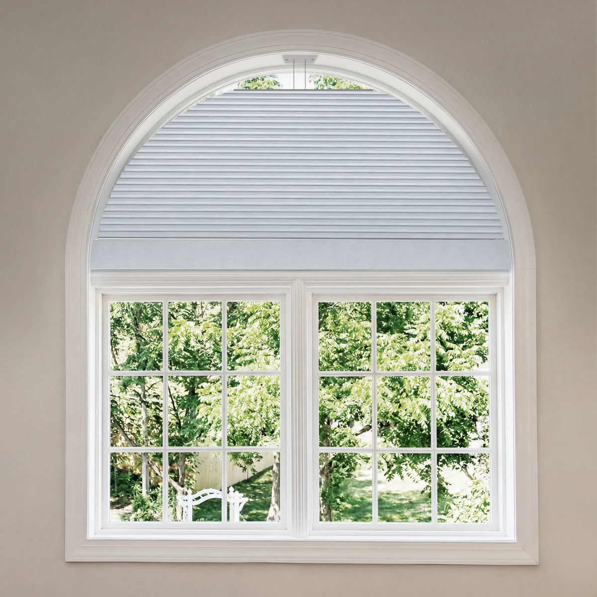
- Forgetting the exterior view: Some treatments are visible from outside. Consider whether street-facing windows need a more consistent appearance.
- Prioritizing color over function: A beautiful hue cannot compensate for the wrong privacy, glare, light-filtering, or blackout level.
- Matching too literally: Repeating the exact same shade everywhere can feel flat. Related tones and varied textures usually create more depth.

When Neutral Window Treatments Are the Better Choice
Choose neutral treatments when the room already has patterned walls, colorful upholstery, prominent artwork, or an important view. They also simplify open plans with several palettes. For frequent decorating changes, neutral treatments with bold accessories require less commitment.
Choosing Bold Colors With Graywind
Graywind supports bold-color decisions across different treatment structures rather than treating color as a separate feature. The roller shades includes color filters such as blue, green, red, purple, charcoal-friendly gray, and black, making it useful for clean blocks of color. Roman shades add folds and textile depth, while custom curtains offer a fuller decorative surface with options including blue, green, navy, gold, and multicolor fabrics.
Start with the room's light-control requirement—blackout, room darkening, light filtering, or sheer—then compare color and texture within the suitable products. Graywind recommends checking fabric swatches at the actual window before ordering, since daylight, interior lighting, and fabric opacity all affect the finished color. For a coordinated home, the goal does not have to be one identical shade everywhere; a repeated undertone can connect different treatment types while letting each room keep its own mood.