Selecting the perfect color for your window shades is one of the most impactful decisions you will make in your interior design journey. It is a decision that balances art, science, and psychology. Unlike a sofa or a coffee table, window treatments interact directly with natural light—the dynamic element that changes how every color in your room looks from sunrise to sunset.
At Graywind, we believe that window treatments should do more than just cover a window; they should elevate the architecture of your home. Whether you are looking for the honeycomb warmth of a cellular shade or the clean lines of a motorized roller, color is the final, critical layer that ties your space together. This guide will help you navigate neutrals, room-specific psychology, material reactions, and even 2026’s runway trends to find your answer to the burning question: What color shades should I get?
Harmonizing Shades with Your Existing Decor
Before you look at a color wheel, look at the largest surfaces in your room: the walls and the floor. Your window treatment should act as a bridge between these two elements.
The Wall-Relative Rule
The safest, most architecturally sound approach is to choose a shade color that is in the same color family as your walls, but shifted by one degree of lightness or darkness .
- Lighter than the wall: If you have deep charcoal or navy walls, a light grey or cream shade will prevent the room from feeling like a cave while keeping the moody aesthetic.
- Darker than the wall: In a bright white or soft beige room, introducing a shade that is one shade darker (e.g., warm taupe or greige) anchors the space, adding weight and preventing the room from feeling "floaty."
Extending the Floor
Your floor is your visual anchor. If you have rich walnut hardwood or a deep ebony tile, pulling that color upward onto the window frames creates an illusion of expanded square footage. Faux wood blinds or basswood blinds in a matching stain are exceptional for this, creating a seamless vertical line that draws the eye up .
The "Never-Fail" Neutrals
If you are planning to sell your home, change your decor often, or simply want a timeless look, stick to the holy trinity of window treatment colors:
- Warm White/Cream: Excellent for reflecting light and making small spaces look larger. Works best with light-filtering roller shades or sheer Roman shades.
- Greige (Grey + Beige): The ultimate transitional color. It bridges the gap between cool grey tones and warm beige tones, making it universally compatible with almost any wall color.
- Charcoal: The new black. It offers high contrast, hides dirt well, and provides the best backdrop for "through-window" visibility during the day.

Functionality First – Color by Room
The same color that looks stunning in a sunny living room might sabotage your sleep in a bedroom. Here is how color psychology and physics play together.
Bedrooms: The Darker, The Deeper, The Better
For restorative sleep, your brain craves darkness and calm. Deep, rich colors are your ally.
- The Science: Light colors reflect light; dark colors absorb it. If you need a blackout shade, a dark color (like Navy, Espresso, or Deep Charcoal) will absorb stray light beams, ensuring total darkness. A white blackout shade can sometimes create a "glow" effect, where the fabric itself looks illuminated by the sun behind it .
- The Palette: Deep teal, slate grey, and midnight blue. These hues lower the heart rate and signal to the brain that the day is over .
- Graywind Insight: Our 100% Blackout Roman Shades in deep textures not only block light but add a luxurious, soft upholstered look to your sleeping sanctuary.
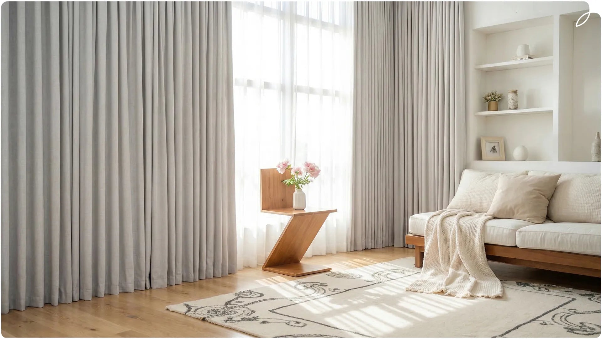
Living Rooms: Light, Bright, and Airy
The living room requires flexibility. You want natural light during the day but privacy at night.
- The Strategy: Choose light-filtering fabrics in pale neutrals (Oyster, Linen, Light Bisque). These colors bounce sunlight deep into the room, reducing the need for artificial lighting.
- The Visual Trick: Mounting light-colored shades high and wide makes your windows—and by extension, your room—feel significantly larger .
- Consideration: If you have a large TV or projector, consider dual shades (a light sheer and a dark screen) to manage glare during afternoon movies.
Kids' Rooms: Bright, Not Brash
Children's rooms should be stimulating but not agitating.
- The Balance: Avoid primary reds or neon yellows, which can be overstimulating. Instead, opt for soft pastels (powder blue, blush pink, seafoam green) or primary colors with high saturation but low brightness (think denim blue or olive).
- Safety First: With the trend of motorization, cordless is the only way to go. Graywind's motorized shades allow you to adjust your child's environment without dangling cords, keeping the room safe and color-intentional.

The Chemical Reaction – Color & Material Science
A color is never just a color. It is a color on a material. The material dictates how light interacts with the pigment.
Fabric (Roman & Roller Shades)
Fabric absorbs light. It creates a soft, diffused glow.
- Best for: Solid, deep colors or subtle woven textures.
- The Effect: A dark green in fabric feels velvety, rich, and organic.
- Graywind Collection: Our Natural Woven Roman Shades use organic fibers that retain slight tonal variations, adding depth that paint cannot replicate .
Faux Wood & Aluminum (Blinds)
These materials are hard and reflective.
- Best for: High-humidity areas (bathrooms, kitchens) and modern aesthetics.
- The Effect: A pure white aluminum blind looks crisp and clinical (great for a modern office). A white fabric shade looks soft and fluffy (great for a bedroom) .
- Pro Tip: For Faux Wood, err towards matte finishes. Glossy finishes on blinds can create harsh glare if the sun hits them directly.
Wood (Real Basswood)
Wood has grain. Therefore, you aren't just choosing a color; you are choosing a stain.
- The Rule: Never try to hide wood grain with heavy paint. Embrace the wood tones (Cherry, Maple, Walnut). They add a layer of organic biophilic design that flat colors cannot achieve.

According to the Pantone Fashion Color Trend Report for Spring/Summer 2026, the world is moving towards "divergent colors designed to unleash individual expression" . We saw this at New York Fashion Week, and it is bleeding into high-end interiors.
Here is how to translate the NYFW SS26 Runway into your home:
White Onyx & Angora (The Clean Slate)
Designers are moving away from stark, cold white and towards warmer, tactile whites .
- Application: Perfect for Sheer Shades in the living room. These "seasonless shades" create a calm, breathable space.
- The Graywind Edge: Our Light Filtering Series in Floral White or Textured Beige captures this trend perfectly, adding that "Angora" softness to harsh sunlight.
Lava Falls & Burnt Sienna (The Accent)
NYFW showed a lot of "daring heat" . While you might not want red window treatments, this palette is for the details.
- Application: Use this color in the tape of a Roman shade or the cord/cassette of a roller shade.
- Strategy: "Color drenching" is out; "color shocking" (small, vibrant surprises) is in for 2026 .
Alexandrite (Deep Teal)
The standout color of 2026. This is a blue-green with high saturation but low brightness.
- Application: Stunning in a home office or library. Use it on Blackout Roller Shades to create a "jewel box" effect.
- Pair with: Brass hardware and cream walls.
Which colors to avoid?
Be cautious of mid-tone yellows and bright purples for large windows. Unless perfectly lit, these can cast unflattering skin tones into the room. For color blindness considerations, avoid red/green combinations in the same treatment, as these become muddy for a significant portion of the population.

Graywind Defines Modern Luxury
You now know the theory. You understand the trends. The final step is execution.
At Graywind, we reject the idea that you must choose between high-end aesthetics and modern convenience. We believe that a window treatment should fit your window perfectly, your life seamlessly, and your style exactly.
While other brands offer generic sizes and limited palettes, Graywind operates like a custom atelier.
Here is how we solve the specific problems outlined in this guide:
Color Precision (No more guessing)
Because color changes with material, we provide free fabric swatches. You can see how “Sand Beige” looks on our vinyl waterproof line versus our textured blackout fabric before you buy. We ensure your greige matches your walls, not fights them.
Material Mastery for Every Room
- For the Kitchen/Bath: Choose our Vinyl Waterproof Series. It resists humidity and comes in clean, high-reflective neutrals that resist mildew .
- For the Bedroom: Our Smart Blackout Shades in Deep Navy or Charcoal. The dark fabric enhances the blackout seal, and with our motorized system, you never have to touch the fabric—preserving the pristine color for years.
The Smart Home Integration
Graywind motorized shades integrate with Alexa, Google Home, and Apple HomeKit. Schedule your Cream White shades to rise with the sunrise simulation—automation that enhances your circadian rhythm, fitting seamlessly into a luxury smart home ecosystem.
The Graywind Difference: We are not just selling blinds. We are selling the confidence that you picked the right color. From the way the light hits the fabric in the morning to the way the darkout lining holds the night at bay, every detail is engineered for the discerning homeowner.

Ready to transform your space?
Browse the Graywind. Whether you need the 100% Blackout Dark Grey for your sleep sanctuary or the light-filtering Linen Beige for your airy living room, your perfect shade is just a custom cut away.


